When creating charts, I often find myself having to meddle with colours. This is particularly the case when I am creating complex charts for Dynamics CRM, or some KPI in Excel to be included in a SharePoint dashboard. If you want your dashboards, reports and charts to look appealing, you must know how to work with colours.
However the right colour combination goes beyond simple aesthetics; it helps convey the correct message. Colour can be used to identify the natural order of values, indicate figures that required immediate attention, and help differentiate neighbouring elements.
To find the correct colour combination can be a tedious choir. Particularly when you just want to get it over with. My trick is to use the default Microsoft Office colour theme as a reference. In order to make this task easier, I created a reference chart with listing the colours along with both RBG (red/blue/green) and hexadecimal values.
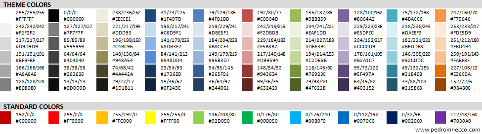
You can also click here to download a PDF version of the this sheet.