When I was about 8 years old, I saw in an art gallery a painting that got stuck in my memory forever. The canvas had an textured, icy grey background colour. Besides that it had only two thin lines of paint crossing each other forming an “X”. One of those lines was painted in a soothing lilac tone, starting half-way to the bottom left of the canvas and going on a tangent towards the top-right corner. The other line was a striking tone of pink, which started with a gentle stroke, increasing in contrast as it went on a tangent towards the top-left corner.
Then I checked the price of that piece of work. The next thing I remember was my mother reprehending me for cursing out loud in a public place. This story came to my mind today as I was installing Windows 8, and reflects what I think of the whole hype around the Metro interface.

Don’t get me wrong. I like Metro. I think Microsoft hit the nail right on the head for a touch interface. But here is the thing: Let’s leave Metro to serve its purpose. That is: tablet devices and touch-based interfaces. Now, I know that Microsoft is saying (and even demonstrated) that the Metro interface will be side-by-side with the traditional desktop, that users can switch between Metro and the traditional desktop any time they want, and so on. But in practice, Windows 8 insists on pushing the Metro interface at every opportunity. For instance, look at the Windows 8 setup screens.
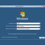
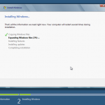
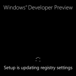
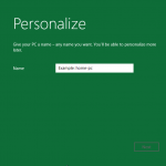
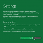
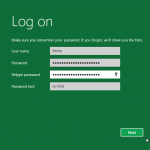
Seriously, is this supposed to be chic or innovative? Fair enough this is a development preview, but come on! Those screens look like they were designed on Microsoft Paint (by someone who doesn’t know how to use Microsoft Paint). If those screens are anything near to what we should expect from the final version, I am not impressed. I fear that the whole Metro concept can be used as an excuse for lazy artwork (or no artwork at all, which at this point I’m not sure what would be worse).
So I installed Windows 8 and I went to have a look at the initial desktop. Once again, it focus on the Metro by default. I can click on the desktop tile to go to the desktop, but if I click at the Windows logo to access the start menu, it brings me back to the Metro interface. Sigh…
Update: Neowin.net has published an article on their site explaining how to restore the classic start menu in the Desktop of the Window 8 Development Preview (requires editing the registry). You can read the article here.
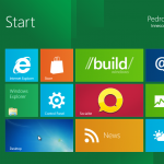
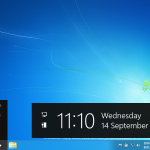
Asserting that Metro is “the future” is, in my view, an overestimation that implies that Metro will be pervasive in upcoming versions of Windows and is likely to replace the traditional desktop as we know it. I hope that it isn’t the case, and that Microsoft is just heavily focusing on the Metro interface at this stage of the development of Windows 8 because it is a new thing which they’re trying to promote. Again, I like Metro, but I am not on my Windows Phone or at a tablet here. I am trying to use my desktop and the overly simplistic interface infuriates me.
I am sorry but I don’t think that the Metro interface has its space in desktop computing. For instance, I can’t see trading workstations, engineering or CAD/CAM software running under it. I want my desktop back. Can I have it please?

"look like they were designed on Microsoft Paint (by someone who doesn’t know how to use Microsoft Paint)"